In this bite, we will take you through ways in which you can explore and describe your data set to give you the confidence to use descriptive statistics and interpret them in your own research.

Why we use descriptive statistics
When working with a data set, the goal is to make sense of the data in a way that is meaningful, to help us better interpret the data. Data sets can often be large and not intuitively make much sense, therefore descriptive statistics allow us to summarize features of the data to give a clearer picture of the data at hand. We also might want to use inferential statistics to test hypotheses, therefore we should always explore the data first. This can help us:
- Discover patterns or trends in data
- Check the data for outliers
- Find violations of test assumptions
- Generate hypotheses
We can describe, summarize or explore data by answering a few simple questions using various techniques. For example, where is the center of the data? How spread out is it? What is the shape of the data? And are there any unusual features? We can seek to answer these questions through measures of central tendency, measures of spread as well as using visualizations.
Measures of central tendency
Measures of central tendency are a descriptive summary of a data set expressed as a single value. You have no doubt encountered these concepts before, however below is a refresher of the common measures of central tendency and examples of when they are useful
Quick recap
- The mean is calculated by adding up all your values and dividing by the number of values. It can be heavily influenced by extreme values or outliers.
- The median is the middle value in the data set, if you were to line all the values up in order of magnitude. As it only uses a single value (the middle) and does not consider all values in the data set, it is not sensitive to outliers.
- The mode is the most common value in the data set.
Measures of spread
Measures of spread, also known as measures of dispersion tell us how data is spread around the middle. This lets us know how well the mean actually represents the data and the degree to which we can trust conclusions that are based on the mean. If the spread of data is large, it is likely that the mean does not represent the data very well. This is because a large spread indicates there are probably large differences between individual scores. Check out the video below for a really good explanation of range, variation and standard deviation.
Quick recap
- The range uses the difference between the largest value in the dataset and the smallest value in the dataset (highest value – lowest value = range) to give us a single value. The larger the distance, the more spread out our data is.
- The variance can be thought of as a stepping stone to finding the standard deviation, as the standard deviation is the square root of the variance
- The standard deviation tells us, on average, how much our scores deviate from the mean score i.e. how much they spread out or clustered together around the mean.
Always be critical! When presented with a mean statistics in everyday life, think critically. If they also provide you with the standard deviation, you should be able to work out how well the mean they are providing really represents the data they are using.
Exploring and describing data visually
Used alone, measures of central tendency/spread can sometimes oversimplify the data. A graphical representation can give a deeper insight into the nature of the data. The type of graphs you can use to explore/describe your data are endless and different graphs are used to explore different things. Here we will cover histograms, box plots and probability plots.

Histograms
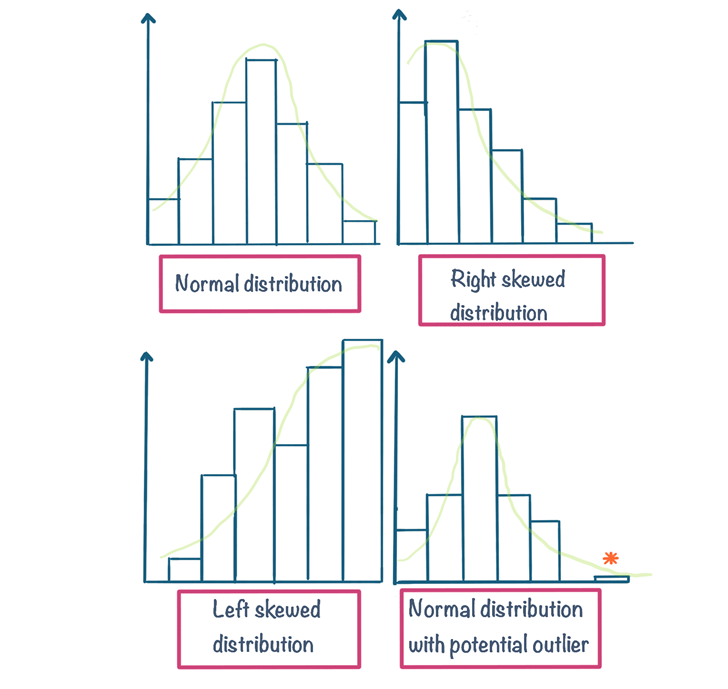
Histograms are a great way of exploring several aspects of continuous data. Histograms let us visually inspect characteristics of our data such as
- The shape or distribution of data (e.g. is it normally distributed, skewed?)
- The presence of extreme values or outliers
Take a look at some example histograms below. This article demonstrates how we can spot all these aspects of our data through a histogram among other uses of histograms in statistics. If your just getting started with statistics you likely don’t need to go into as much depth as the article but it’s important you know the purpose of a histogram and are able to interpret them for significant features e.g. distributions
Box and whiskers plots
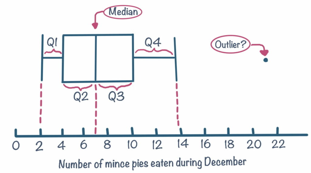
A box plot is also useful at providing the same information as a histogram but in a different way. An advantage of using a box plot is that it gives the exact value of the median. As can be seen from the example below, the range falls between 2 and 14. The line in the middlebox is the median, which is 7. This tells us that half the scores fall below 7 and the other half above 7. The sides that make up the ends of the box also shows another median. The left side is the median for all the scores below 7 (which is 4) and the right side is the median for all the scores above 7 (which is 10).
The box plot is showing us what is known as the interquartile range. It is split up into four quartiles; Q1 ranging from 2-4, Q2 ranging from 4-7, Q3 ranging from 7-10 and Q4 ranging from 10-14. You can also see a single data point at 21. This person falls outside the box plot and could be classed as an outlier, or an extreme value. Box plots can also give an indication of the distribution of data. If the ‘box’ part of the box plot is in the middle, it means most values occur around the centre and likely normally distributed. Similarly, if the ‘box’ is bunched up to the left or right with one tail that is particularly long, this suggests the data is probably skewed. Check out this blog on box plots on how to use and interpret them for a more in depth look.


Probability plots
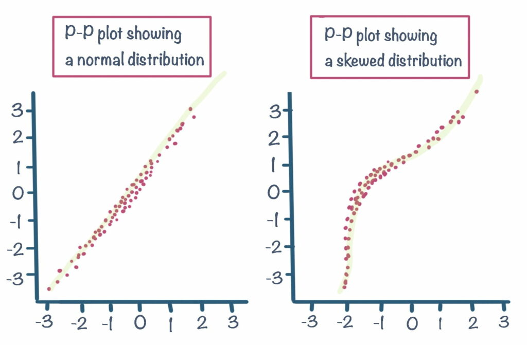
Probability plots (or p-p plots) are a good visualization to check whether your data is normally distributed or not. As you have learned, you can already do this primarily by looking at a histogram or alternatively through a boxplot. Probability plots on the other hand give a more detailed view of how your data is distributed. A probability plot, plots your data against associated z-scores, which you can learn about in “Stats Bites: Distributions”. Using a p-p plot to check for distribution allows you to see more easily exact data points which may be skewing the distribution.
Data that is normally distributed will approximately follow a straight line, whilst data that is skewed will present a non-linear pattern.
